Marc Gispert Saget
Digital Product Designer
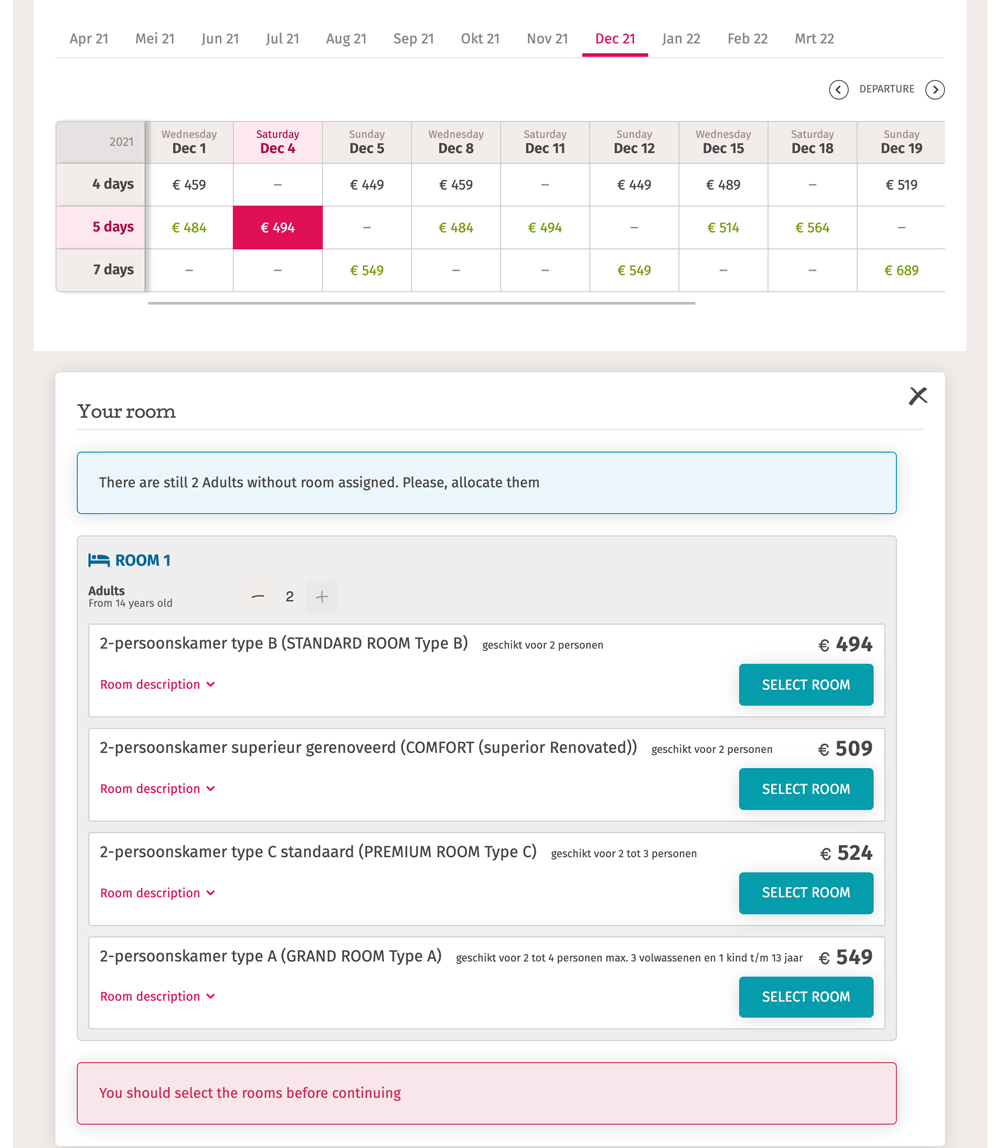
New room selector
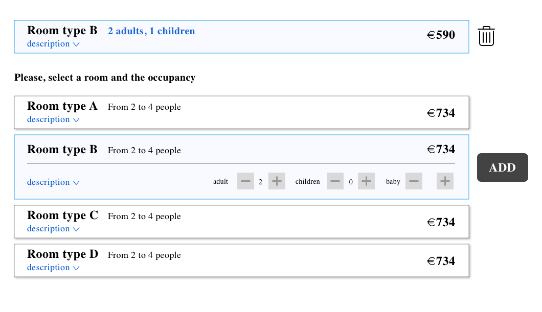
Have a single list of rooms where the user can compare rooms between description, allocation and price
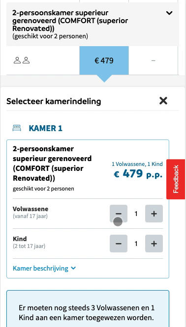
The room selector is a component that it’s used to allocate people that have previously selected a price on the price table selecting the type of room they want with the appropriate room allocation.
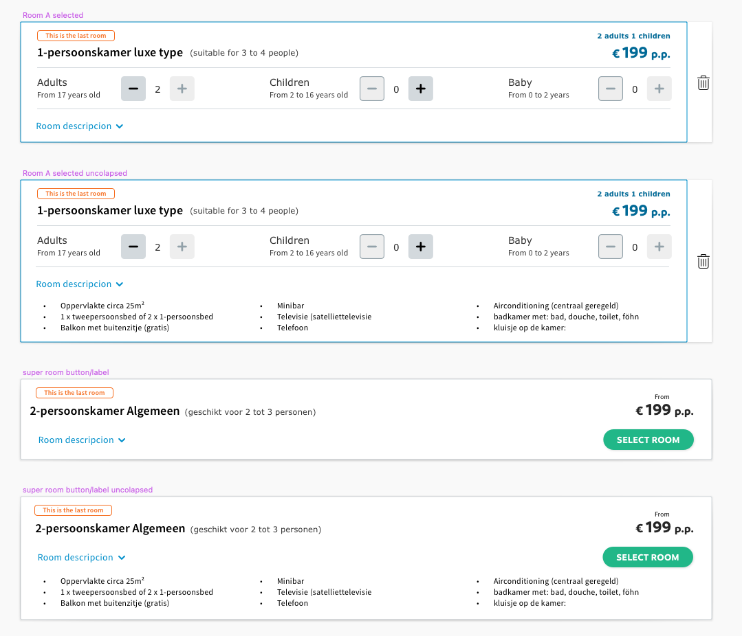
With the new design the user experience is noticeably increased making the customer able to compare between rooms, and their descriptions, prices (updated according to the occupancy) and occupancy within the same list.
New room selector on production on the Dutch site
Brand
Sunweb Summer - Eliza was here - Gogo - BizztravelTimeline
4 sprints of 2 weeks (research, wireframing, prototype)Research
Checking user behaviours and party compositions patternsPrototyping
Wireframes and digital prototypesTesting
Usability tests, Quantitative tests.Strategy
UX strategyVisuals/UI
Based on the room selector based on room typesResult
User experience and conversions noticeably increasedURL
Sunweb site
Challenge: have a single list of rooms where the user can compare rooms between description, allocation and price
Let's have some context
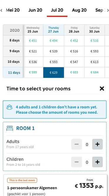
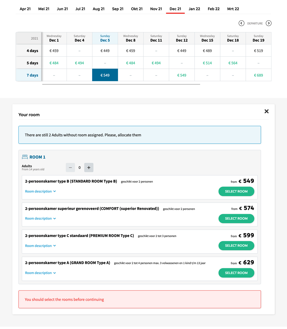
After filing the quick search fields on the home page, with the departure airport, date, duration and participants, the user goes to the search and book page where he/she is able to select an accommodation. Once on the accommodation page the user is able to check and select a price within the price table.
The room selector is a component that it’s used to allocate people that have previously selected a price on the price table on the rooms they want with the appropriate party composition.
What is the problem?
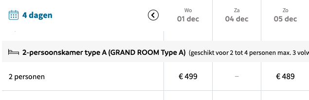
While on the old price table the user is able to compare departures, types of room and allocations - and the price depending on the allocation -, on the new price table the user can see the cheapest price comparing departure date and duration.
Firstly, This means that the old room selector - basically a dropdown with a list of the available rooms (see an example below) - is not valid anymore since with the new price table, that performs much better, the user can not compare between type of rooms, other prices options and occupations.
Secondly, because the old room selector already has some usability problems such as the impossibility to compare the information of the rooms, the limitation of the content within a dropdown and other not well resolved design issues.
Price table 1 detail
Price table 1 general view
Price table 2 detail
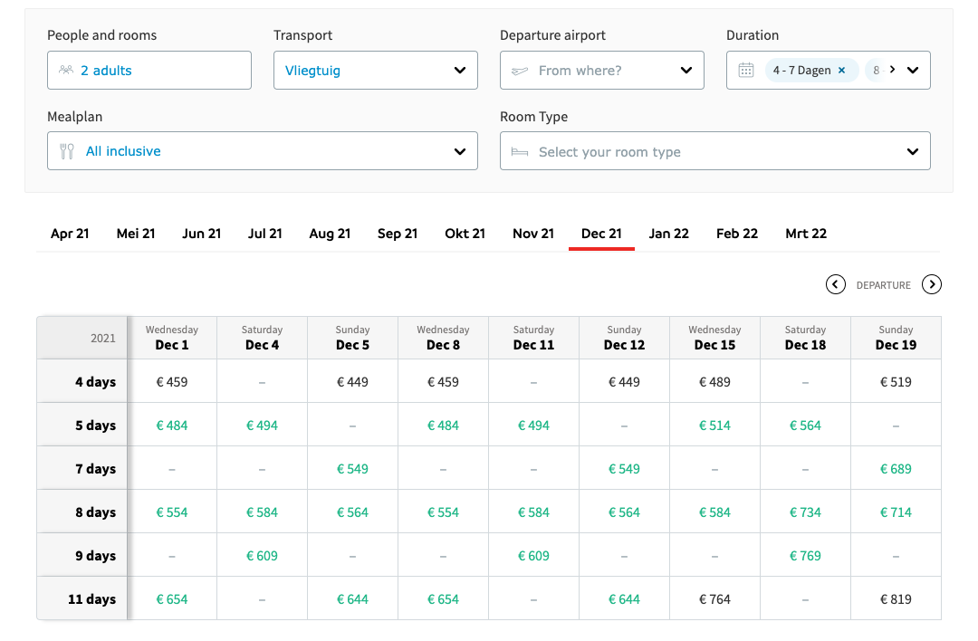
Price table 2 general view
Example of the old room selector through a dropdown
Proposed solution?
Having a non-complex design of a list where the customer could easily compare between rooms, and their descriptions, prices (updated according to the occupancy) and occupancy options on the same list.
To consider
Sunweb is the main brand of a group of travel package seller brands with different or complementary targets. Not all these brands are selling the same, some of them only sell winter packages while others just sell summer packages and sometimes different kinds of products also.
On the other hand the way to build the front-end part of all these sites is through a Design system - that we the IT team already bought a pair of years ago - this means that when we design a component we are designing for different brands at the same time.
Why am I mentioning this? Because the different personas and the different customer journeys. Sunweb has recently created a group of personas and customer journeys representing each brand but on the first stage of this issue personas/focus groups were considered in a generic way and it kept the existing generic customer journey.
Note: A big difference if Sunweb is compared with other companies is that while competitors use to build the travel packages dynamically step by step, Sunweb comes from a non digital business model based on selling closed travel packages per catalog, were the customer/seller was able to compare between all the possible combinations (departure, duration, type of room, occupation...), during the digitalization this model was been migrated to a site were the user can easily find the perfect package, with the benefits of the web 2.0. This explains the complexity of this component that has to provide to the user the chance to compare between the details of all the closed packages.
User Centered Design Methodology

User centered design is the methodology that it's considered more effective to design new features. That's because the user it's taken into account in every single step and this allows to build nice products through facts instead of hypothesis. During the design of the room selector it tried as far as possible to follow all the steps of the UCD.
Research
Since the aim of this issue was to adapt the room selector from a previous existing component. It wasn’t think as a completelly new feature but as improvement in therms of engineering from an existing old one.
Customer flow

What competitors are doing?
There are not a lot of competitors selling this kind of travel package in the way Sunweb does. A company that does something similar is Corendon.
If we check their room allocation is basically a list with different room options for the preselected package with the difference that they already did the party composition.
Faced issues
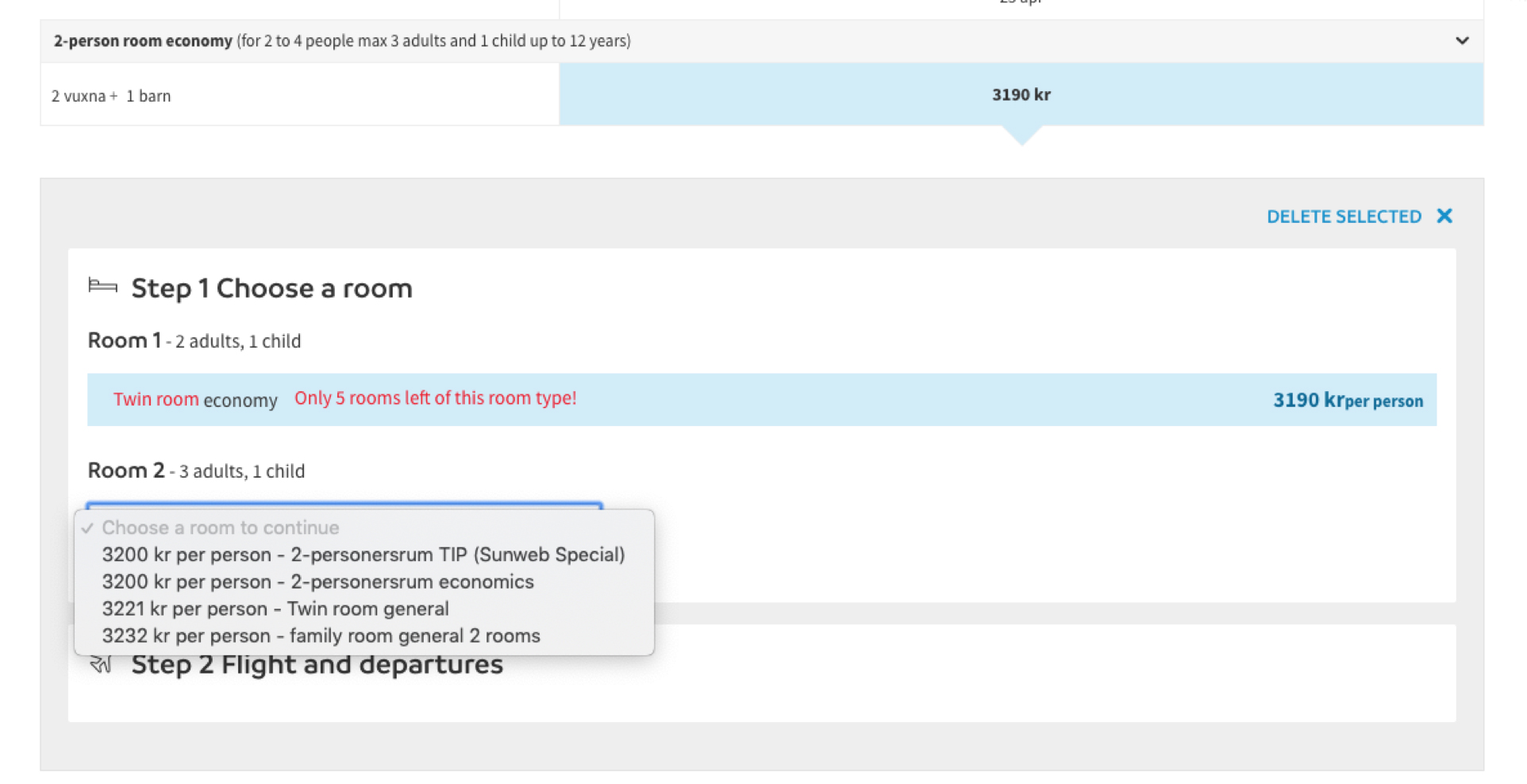
From the beginning it was thought to resolve the room selector such as the flight selector, with a list of rooms with radio buttons, but several functional problems was found.
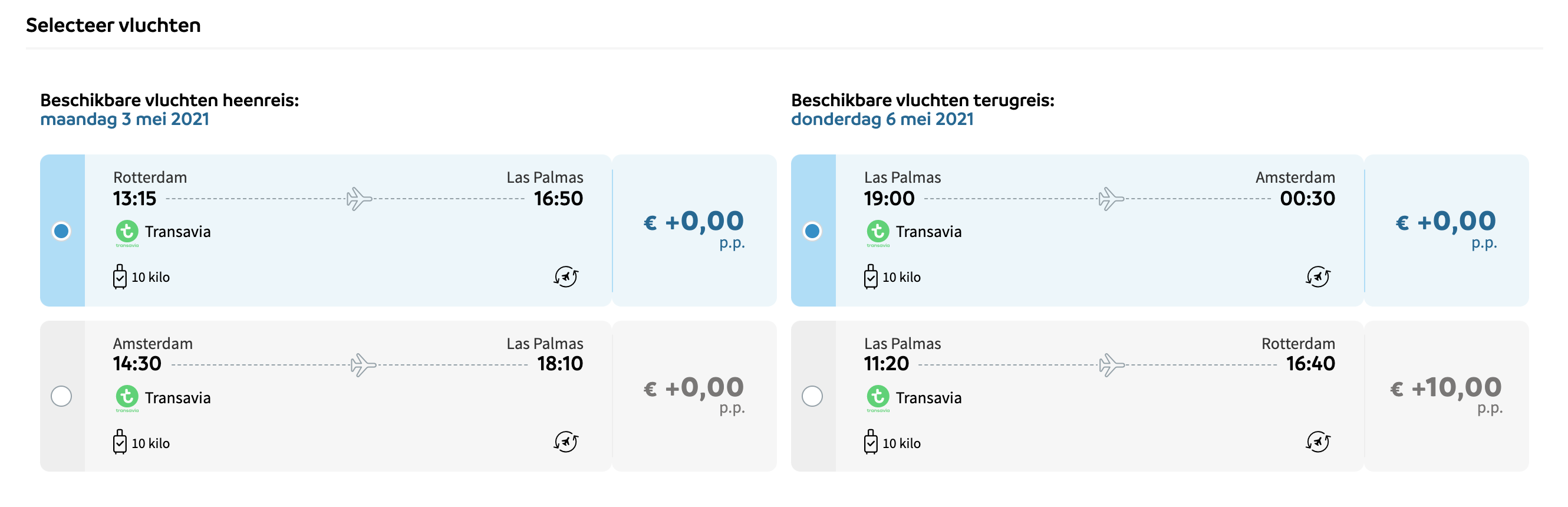
Example of flight selector with the list of flights with the radio buttons
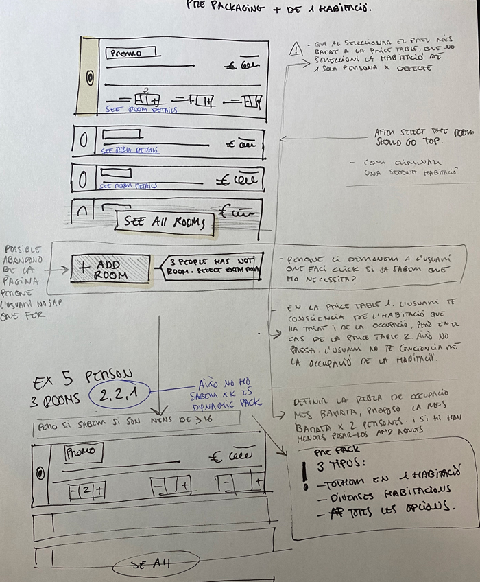
- If we use radiobuttons the items should be allways visible, so if we add a number stepper into it, whe should kep the list opened all the time and add the selected rooms close enough between them, to facilitate the user changing the allocation, all of this is confusing and also very difficult to implement.
- Have to face a very long list of rooms on several accommodations.
- Having a number picker in a radio button was very unusual.
- Making the user click on CTA to add a new room after he already selected a radio button is weird, firstly because it is an action that you already know that user should do but also because the user already made the selection - a kind of redundant action-. But on the other hand, you can’t anticipate that action because you don’t know the participants' allocation.
- Have more than 1 list with the same options one below the other is weird (and ugly)
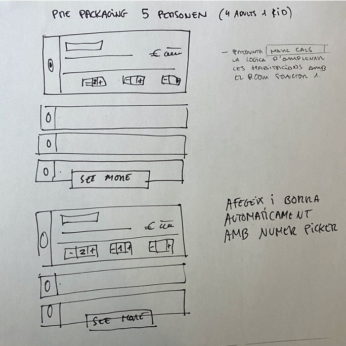
- In pre-packaging we don’t know the room allocation, but we know certain rules such as if they are kids, if them wants to go to the same room or different ones.
- It was also thought to add and remove rooms list when the user changed the participants, but it was a not very friendly way to show the rooms list with a lot of rooms appearing and disappearing, also with the same problem of a list below the list with no chance of comparing rooms and allocations. But also a problem of performance. Recalculate constantly the prices could end in a slow site with things appearing and disappearing.
- It was also thought to show the rooms list in an horizontal way. That way solved some things, and was more aesthetic and modern than the vertical list, but the same problem of adding/removing rooms and allocation was still there. A part from that at front end level the cost of the implementation, taking into consideration the front-end gap on the team, was so big and the expectation of time for the implementation was 4 sprints. Not only that, during the discussionit was challenged the fact that a lot of times the packages sold for summer are for 2 persons, so it means a big cost of implementation for something not tested and maybe not useful/necessary.
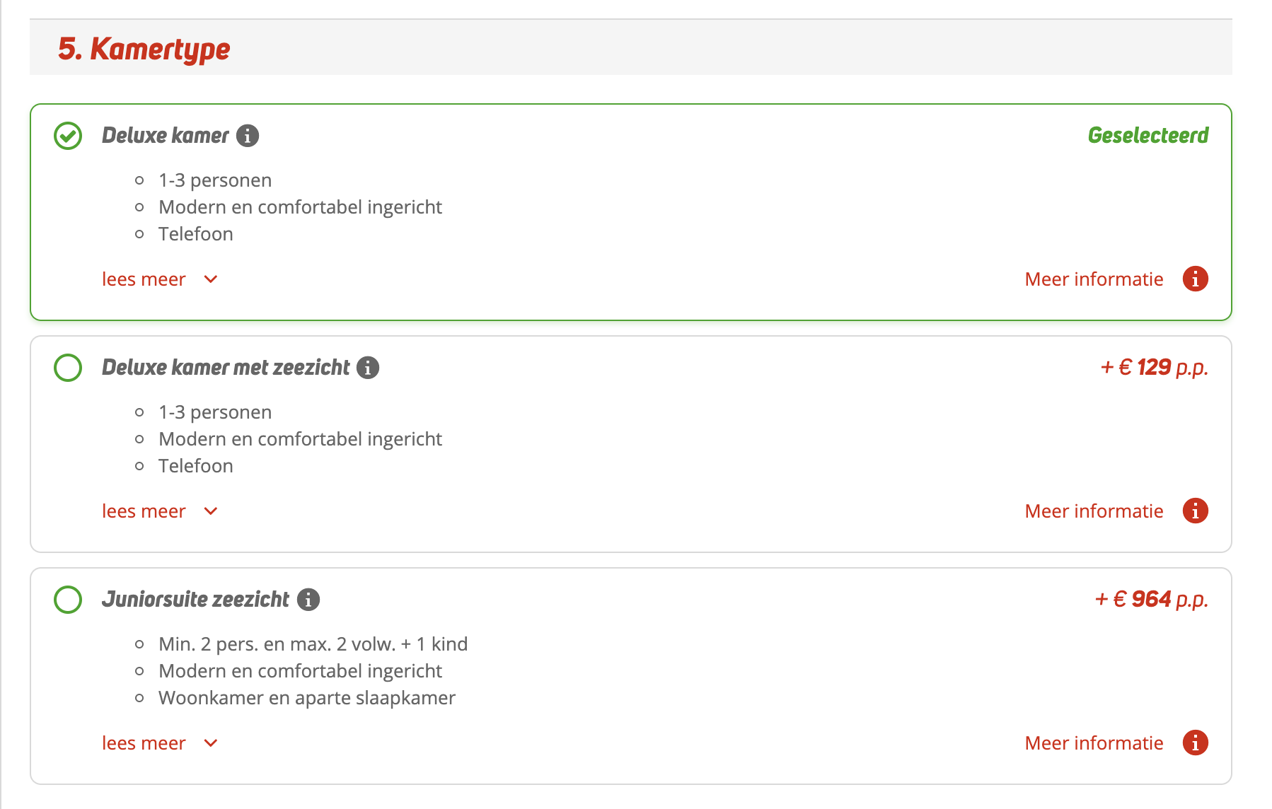
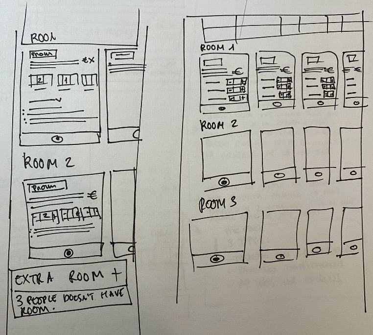
Mockups
The mockup was tested with internal colleagues and the 100% of them had a successful experience according to the proposed scenario.
Unstyled prototype to check functionalities
Check the interactive mockup
It was designed a mockup with the following approach:
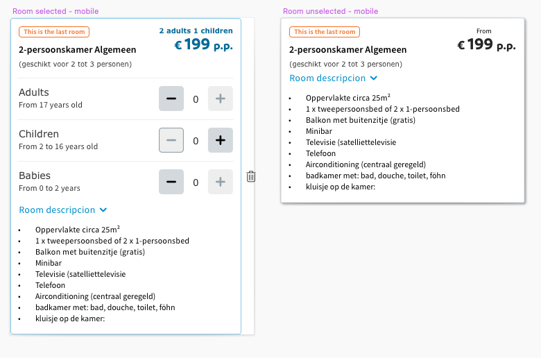
The rooms list will be shown only one time - No matter the number of rooms needed or how the occupancy between them is configured
The user will be able to check the different prices according the allocation and the number of participants on each room
All the prices will upgade in case the user change the number of participants
The rooms that doesn’t fit with the allocation will automaticaly dissapear
All the data will be preloaded so performance problems are not expected
The room description can be checked by the user in any moment/stage
The user will go step by step selecting rooms
The overview of the selected rooms will be clearly understandable for the user
Prototype
Some symbols for the desktop and mobile version
The design of the prototype was thought re-using all the components already created on the design system, such as the price, buttons, number steppers, labels, colapsibles, etc.
A pair of examples of the component live for different brands
These are a pair of examples of the price table matrix with the room selector running on the design system. Even though the room selector is running live with the price table based on room types, I prefer to show in this example together with the price table Matrix.
It's important to mention that there is a A/B testing through Google Optimizer to check different kid of performances and since today the conversions
Room selector example for Sunweb Summer on Design System
Room selector example for Eliza on Design System
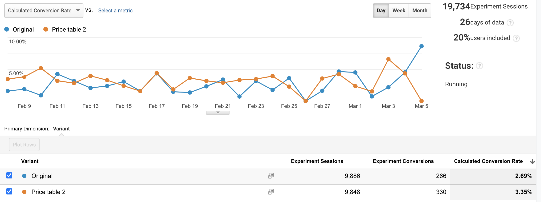
Example a running experiment with analytics demonstrating that price table matrix with room selector performs better