Marc Gispert Saget
Digital Product Designer
The challenge
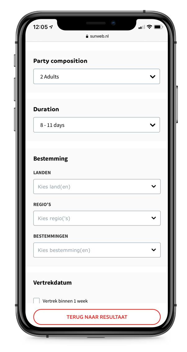
Enable users to compare search results based on location.
Sunweb needed a feature to let users compare travel packages by location. Not only was this a chance to introduce a helpful new feature, but it also addressed a specific issue: some users were leaving Sunweb’s site to search locations on other platforms. From a UX perspective, this meant ensuring that the map design was as intuitive and user-friendly as possible, based on real user insights.
Brand
Sunweb Summer - Eliza was here - Gogo - Bizztravel
Timeline
4 sprints of 2 weeks (Research, Wireframing, Prototyping)
Research
Analyzing user behaviors and group composition patterns
Prototyping
Wireframes and digital prototypes
Testing
Usability testing with UsabilityHub
Strategy
UX strategy
Visuals/UI
Used components from the Sunweb Design System
URL
High-Level Goals
- ●Enable comparisons of accommodations by location.
- ●Reduce user drop-offs by offering on-site location details.
- ●Increase conversions through map-view engagement
Benchmarking
Analyzing the approaches from leading e-commerce platforms for map-based search
To kick off, I conducted a quick review of other popular e-commerce sites that utilize maps for reservations.
Key Findings:
Booking
- ●Map button appears as a generic thumbnail on the right side of the search page.
- ●Map opens as a pop-up on the right.
- ●Zooming out reveals properties globally, but only a few display at a time, requiring zoom-in for further details.
Airbnb
- ●Map appears directly on the search page.
- ●Zooming out shows properties worldwide.
- ●Search results refresh automatically upon zooming out.
Expedia
- ●Map button appears as a miniature on the left side of the search page.
- ●Only properties in the selected area are shown when zooming out.
- ●A cluster displays if there are too many results, e.g., “94 hotels from 242€.”
These insights informed our design decisions and helped shape the initial concepts.
The creative process
Wireframing
Using the benchmarking insights as a foundation, I developed wireframes to start discussions around design options, including:
- ●Using the map button as a thumbnail vs. a regular button
- ●Deciding whether the map should be visible by default
- ●Determining the right number of elements to display at once
Insights
During design review meetings with stakeholders, the wireframes highlighted the need to avoid showing the map by default to help the company reduce unnecessary costs
User Testing
Research and Outcomes
Through user-centered research and testing, we identified key design elements that aligned with user expectations across desktop and mobile interfaces. These findings helped validate design choices, including the map’s position and filter display on the search page.
Research 1:
Expected Mobile Behavior
- ●Explored user expectations post-click on the map button, revealing a preference for minimal distractions on mobile.
- ●Presented two options for the map interface, inviting feedback to understand users’ alignment with each design.
Research 2:
Desktop Interface Layout
- ●Analyzed preferences for map positioning and card layout, highlighting users’ desire for concurrent access to all elements.
Research 3:
Filter Position and Functionality
- ●Validated the ideal filter placement on the map view, aiming for an intuitive interface that reduced user friction.
First research
The first research phase focused on assessing mobile usability expectations:
- 1. Gathered descriptions from users about their expectations upon clicking the map button.
- 2. Showed users two design options and asked for feedback, validating alignment with anticipated mobile use.
Step 1
Step 2
Outcome 1
Findings confirmed the feasibility of including a map button, supporting user engagement on the search page.
Outcome 2
Users preferred a full-screen map with minimal distractions, guiding final design choices.
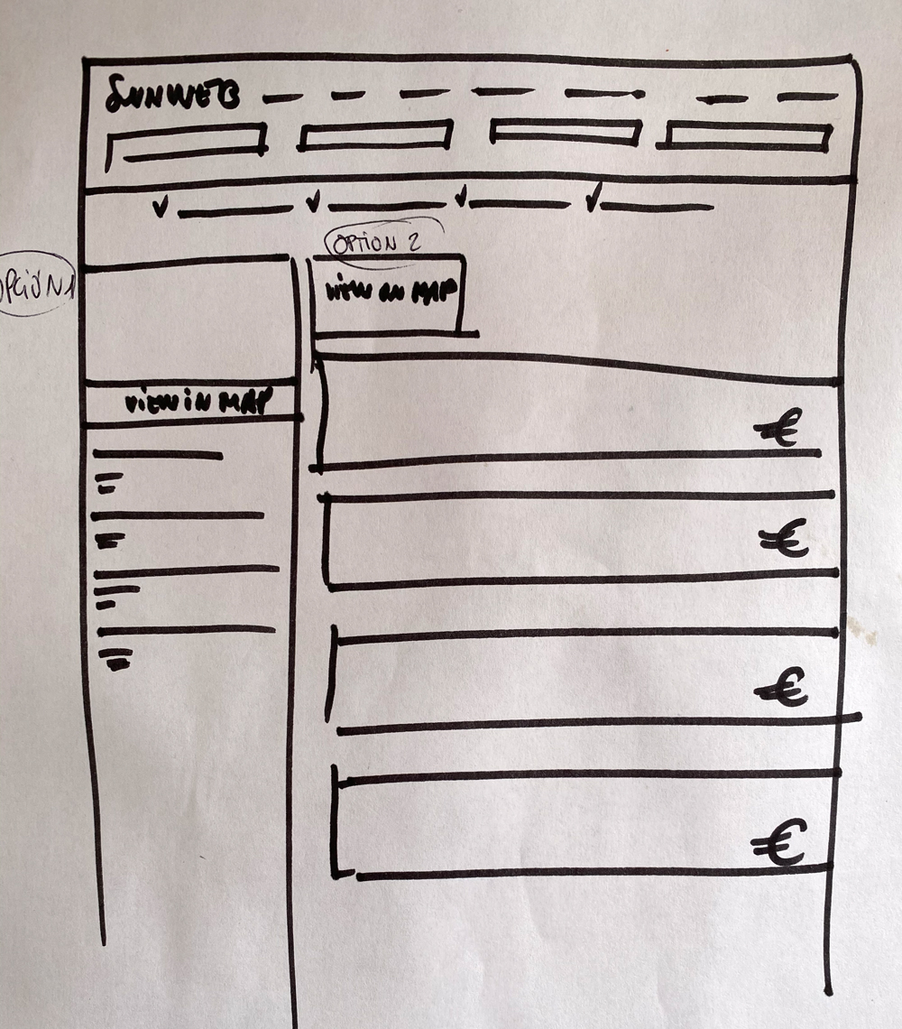
Second research
The goal of this research was double. On one hand, identifying the preferred placement of the map on the search page. On the other hand, exploring user preferences for displaying accommodation cards, including their format and location.
Option 1
Option 2
Option 3
Outcome
What can be understood from the comments of the participants is that users prefer the interface with the map on the top because they are able to check all the elements, filters, map and accommodation cards at the same time.
Third research
This research aimed to validate, through an initial click test, the hypotheses concerning the position, design, and content of the filter buttons in the map view.
Image shown
Results of the first click test
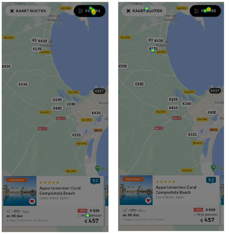
Outcome
It can be seen in the results how most of the participants successfully clicked on the filters button. This confirms the hypothesis that users will find the details of the regular “filters on top” from the Sunweb page within the new filters button for the map view.
This outcome serves as a reliable reference for finalizing the map design featuring this button.
Final insights of the researches
Research 1
Users prefer all options to be easily accessible on desktop.
Research 2
Users favor a minimalistic design with fewer distractions on mobile.
Research 3
Clustering all filters within a single button is effective and user-friendly.
Prototyping
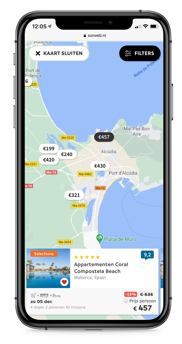
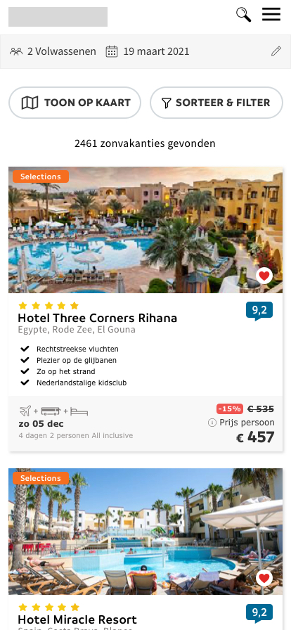
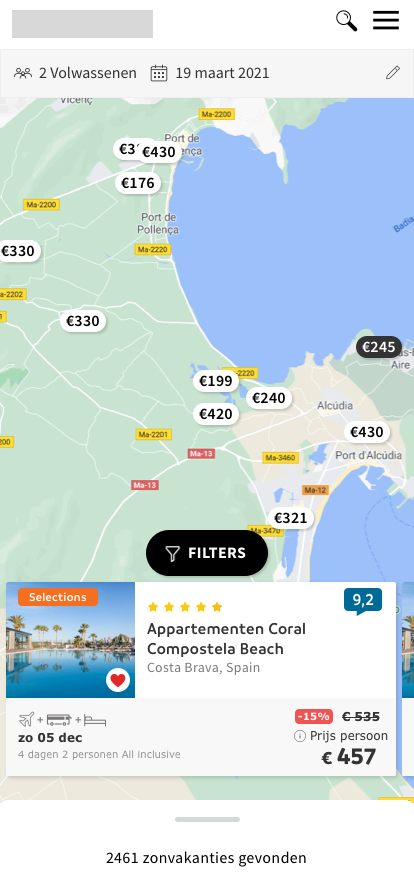
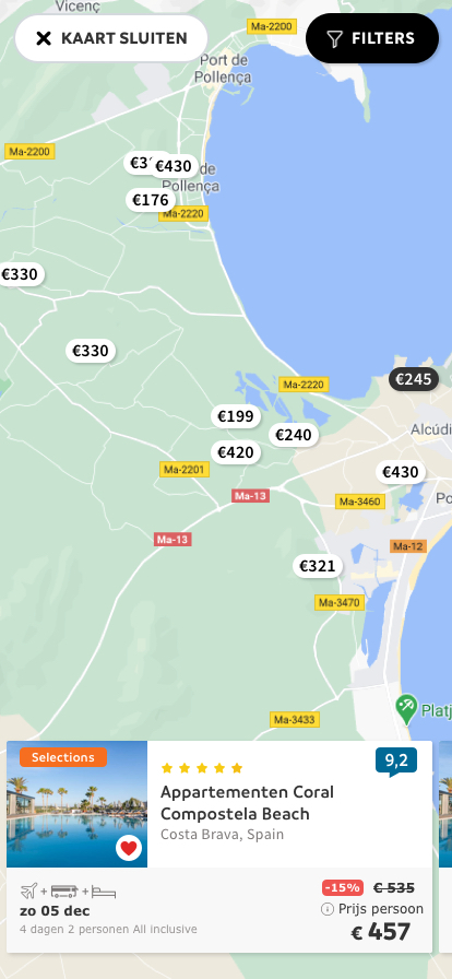
Mobile Design
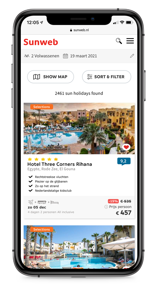
Map button on the right/top of the search page
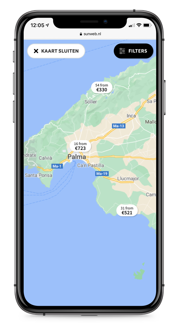
Clustered price views for easy selection
Accommodation card shown upon price click
Regular search filters included at the top
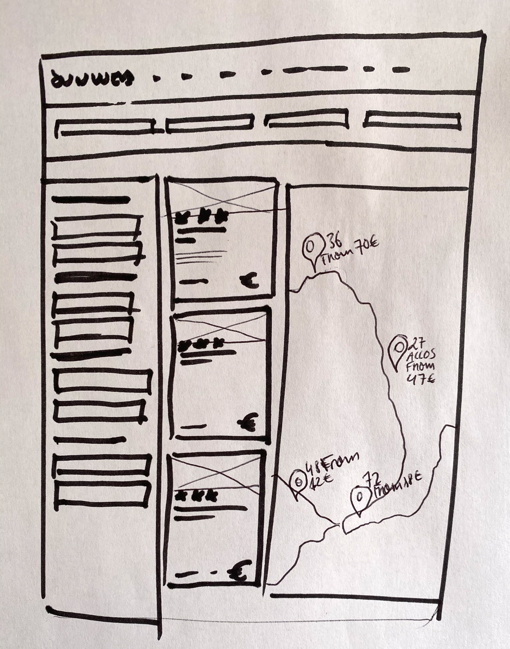
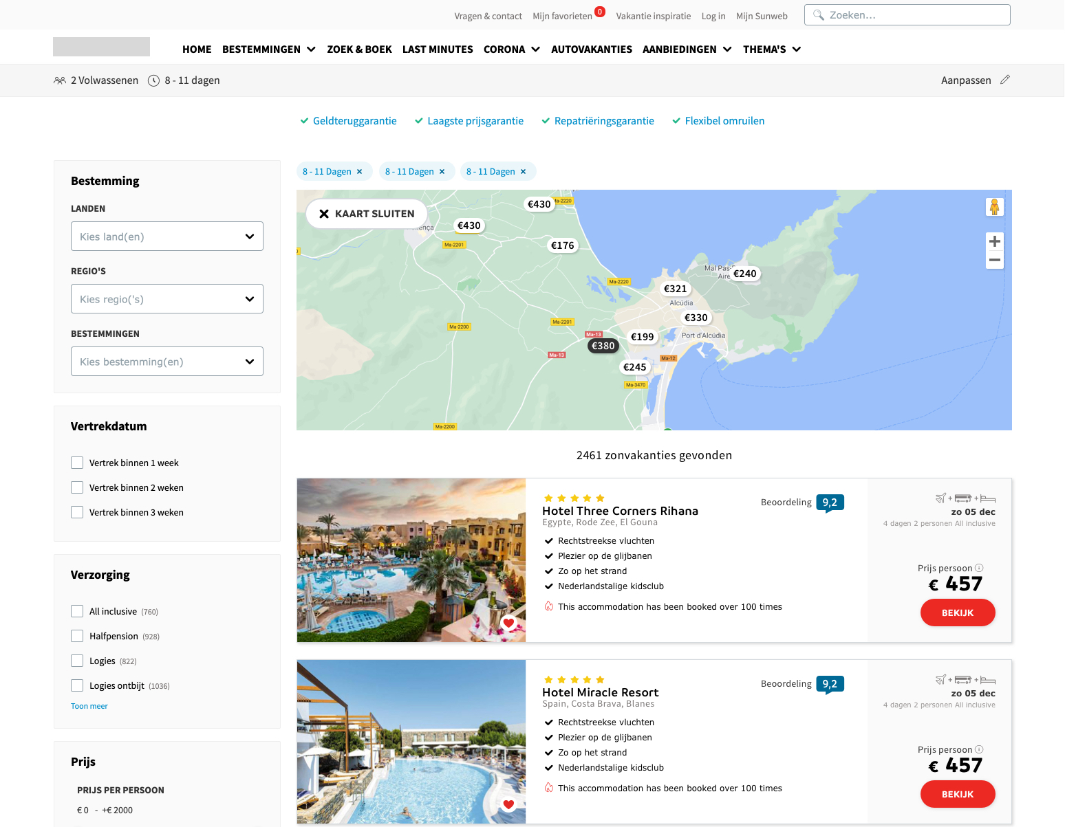
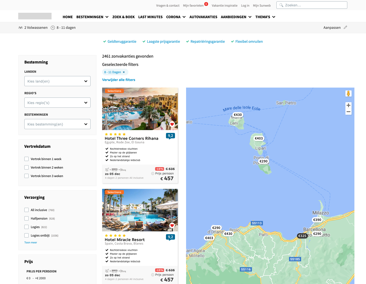
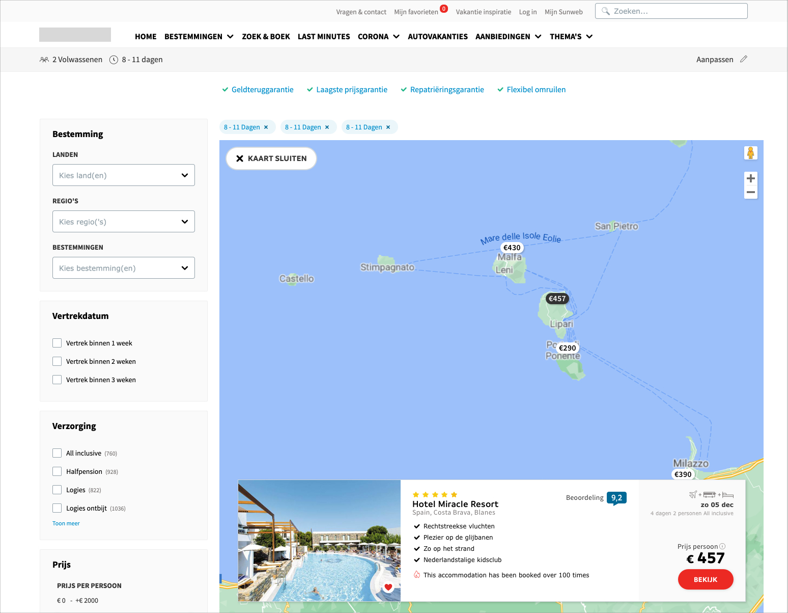
Desktop Design
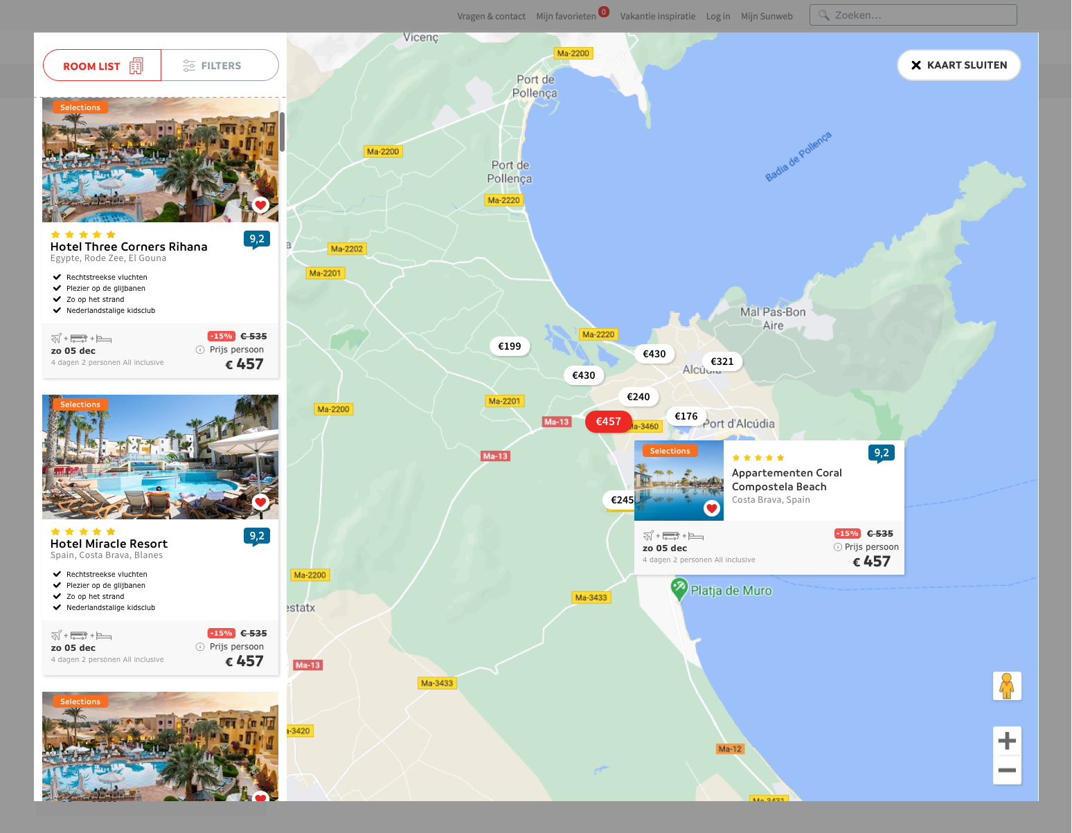
Map on the right with room listings on the left and expanded accommodation card upon selection for a more detailed view
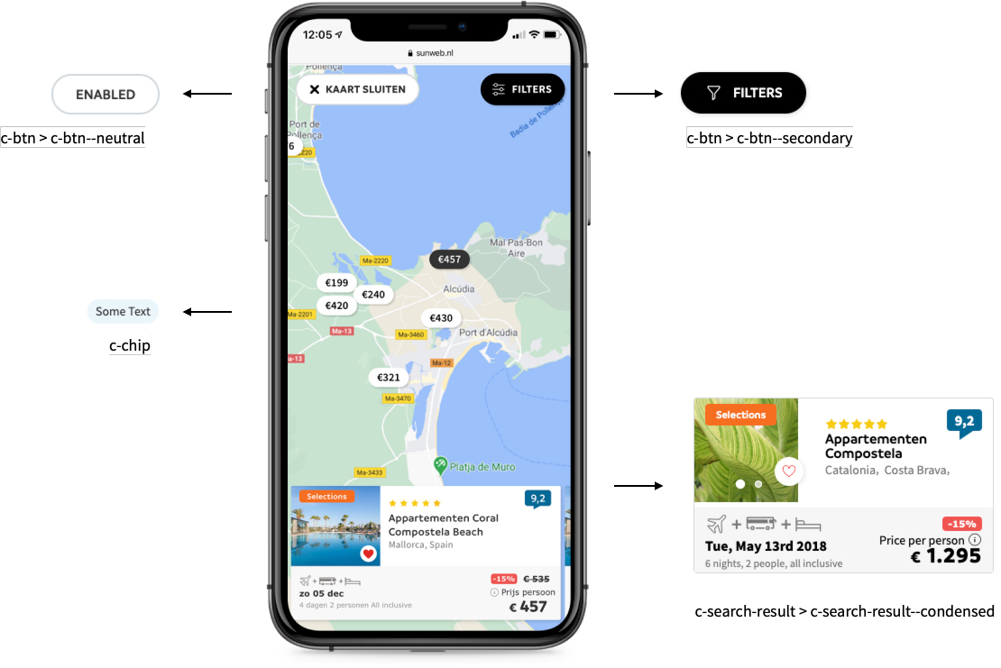
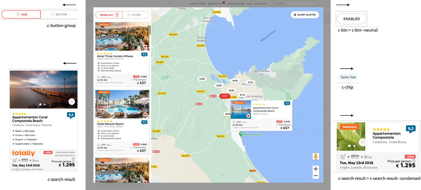
Componentization
Building the prototypes with the components of the design system - Mobile
Building the prototypes with the components of the design system - Desktop
Next steps
Moving Forward
While the design is inspired by successful map features from other platforms, it’s tailored to fit Sunweb’s unique requirements and based on thorough user testing. However, continuous refinement is essential, so these recommendations for further evaluation are suggested:
- ●Use Hotjar surveys to gauge user emotions
- ●Track conversions via analytics (e.g., users booking through map)
- ●Identify potential pain points in the map view through ongoing analysis