Enabling a Better User Experience for Comparing Prices and Choosing Rooms Easily.
Creating a Smooth User Journey by rethinking Price Displays and Room Selection Processes.
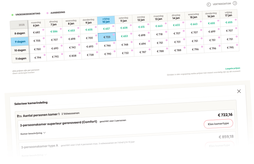
Case description
Approach
While the tasks of comparing prices and choosing rooms are interconnected, they were treated separately due to the complexity of each.
| Brand | Sunweb, Eliza Was Here |
|---|---|
| Timeline | 4 sprints of 2 weeks each |
| Research | Analyzing user behaviors, benchmarking with competitors, stakeholder interviews. |
| Prototyping | Wireframes and prototypes |
| Testing | Usability testing, quantitative performance tests, and A/B testings |
| Strategy | UX design and service design |
| Visuals/UI | Based on design system |
| URL | Sunweb.nl, elizawashere.nl |

Problem Definition
Understanding Sunweb’s Digital Transformation Challenge
Bringing the Traditional Catalog Experience to the Digital environment
Sunweb Group is a leading travel company specializing in package holidays. Unlike most competitors, which dynamically build travel packages step by step online, Sunweb's business model is based on a traditional catalog approach, offering closed, pre-packaged travel options for customers. During its digital transformation, Sunweb faced the challenge of replicating the catalog's comparative nature on its website, aiming to make it easier for users to find the ideal package while benefiting from modern web 2.0 features.
Sunweb’s brands—Eliza Was Here, Gogo, and Bizztravel—target different market segments, including summer and winter packages as well as specialized travel experiences. This unique structure called for a unified yet flexible approach to designing components that could be applied across all brands and enhance the overall user experience.
This case study will address the challenge at a critical stage: selecting the price and room. Although earlier steps, such as filtering, significantly impact the displayed prices, the primary focus is on optimizing the user journey during the selection process, ensuring a fluid experience at this important decision point.
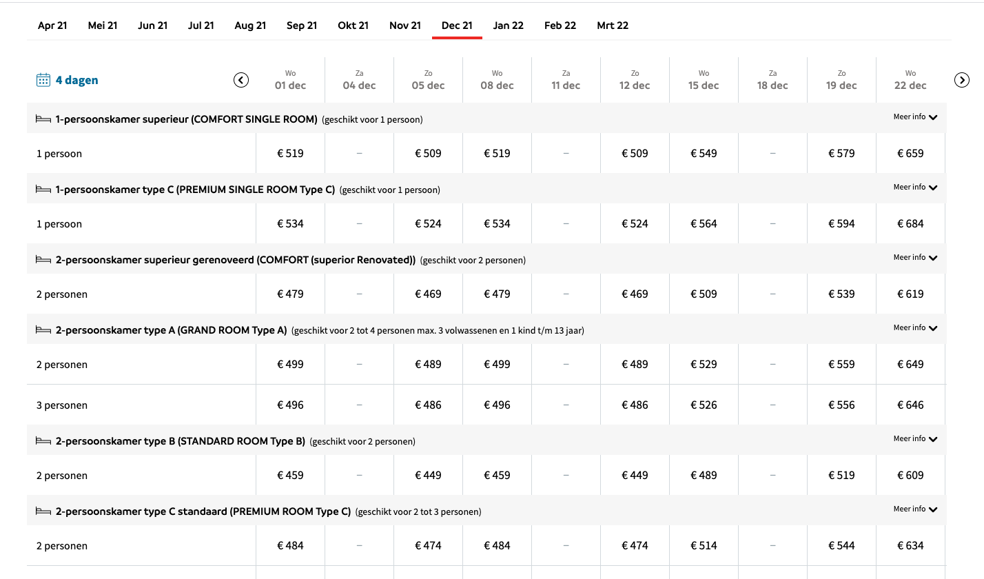
General view of the outdated price table
Key Challenges
Main Issues
Difficulty Comparing Prices by Departure Date and Duration
Users found it challenging to compare travel packages across different dates and durations due to the limitations of the previous price table.
Inability to Easily Compare Room Options and Occupancy
The existing room selector did not effectively present room options, descriptions, prices, and occupancy details, making decision-making difficult.
Challenges in Adapting to the Digital Package Model
Transitioning from a catalog-based business to a digital model required rethinking the way travel packages were presented, ensuring the website could replicate the catalog's comparative experience while providing the benefits of modern digital interactions.
Core Objectives
Main Goals

01
Streamline Price Comparison Across Dates and Durations

02
Facilitate In-Depth Room Comparison for Different Party Compositions

03
Smooth Digital Transition for the Package Selection Process
Fixing the root problem
Streamlining the Filter Selection Process
Before designing the price table, it was essential to address the core issue of filter selection. This underlying problem affected the entire user experience and needed to be resolved first to ensure a smooth flow through the package selection process.
Overwhelming Number of Filters in a Single Step
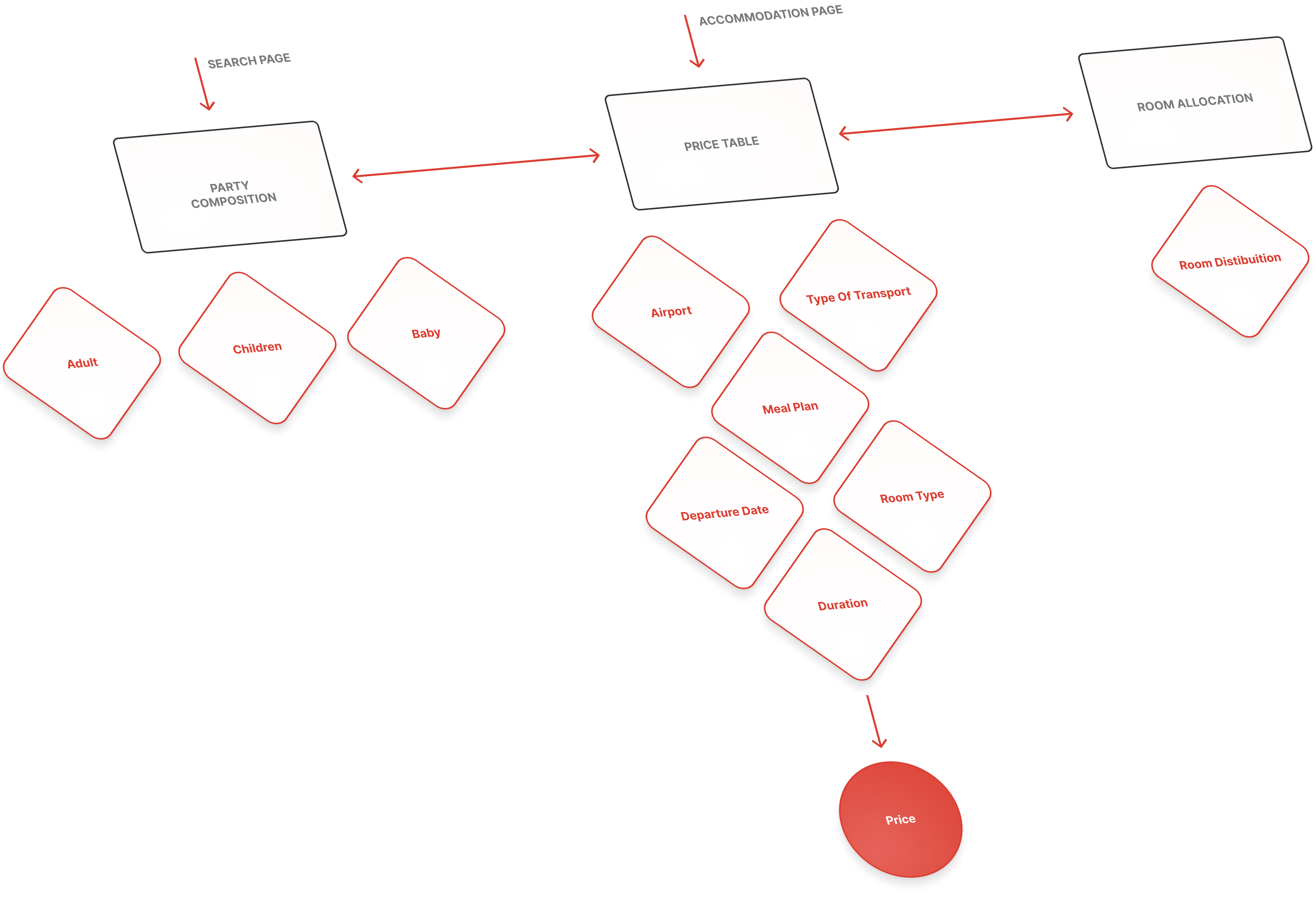
Previously, users had to select multiple filters all at once, including the departure airport, flight, duration, meal plan, departure date, room type, party composition, and room allocation. This overwhelming amount of choices, spread across different pages and steps, created a confusing experience, causing users to go back and forth repeatedly to make adjustments.
Solution - Step-by-Step Guided Filtering
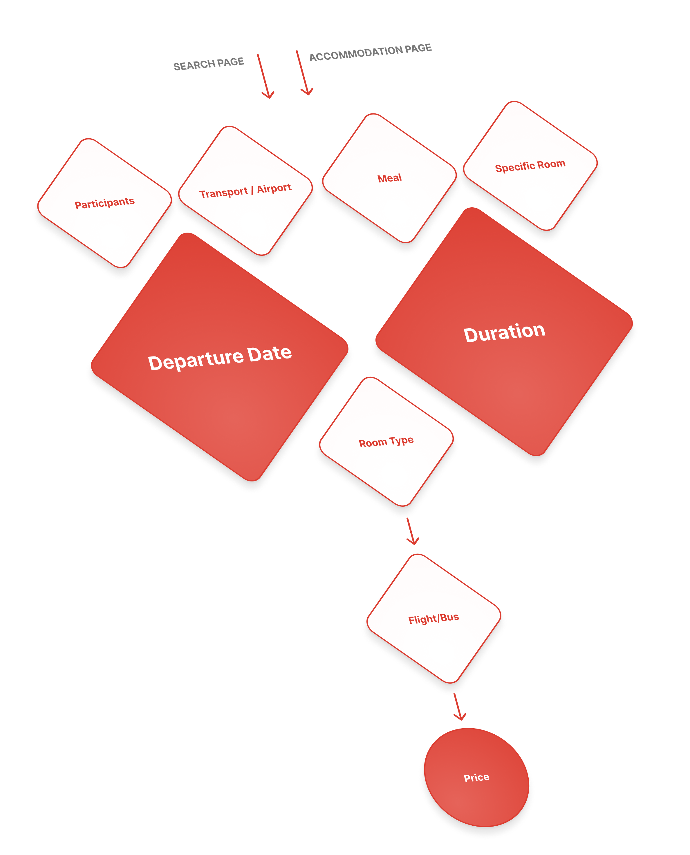
To solve this issue, I proposed a guided step-by-step approach for selecting filters. Instead of presenting all the options at once, users are guided through each filter in a logical order. This approach helps keep users engaged, reduces the need for repetitive navigation, and simplifies the process before showing the prices in the price table, making the flow smoother and more user-friendly.
01.
Price Table Redesign
After addressing filter selection, a low-fidelity prototype was created to improve user flow, featuring clearer navigation through tabs and arrows for different departure dates. This simplified approach made it easier for users to compare travel options.
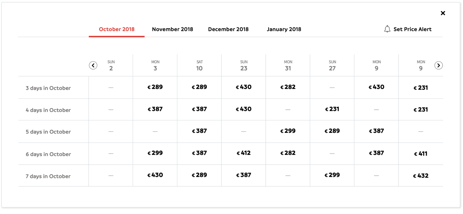
Low-Fidelity prototype for enhanced date and duration comparison
Key Findings
Research Team Insights
After building the low-fidelity and interactive prototypes, the UX research team conducted extensive user testing to validate the improvements to the price table. The testing sessions provided valuable insights and feedback on how the new setup affected the user experience:
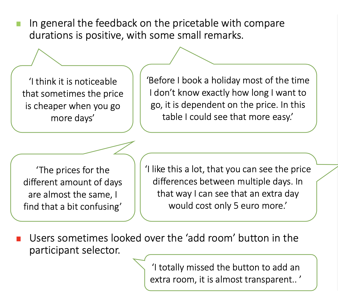
Detail of the report comparing price tables with participants
Key findings
- Room Occupation Confusion: Users found the current price table setup unclear, especially regarding room occupancy.
- Positive Feedback on New Design: The alternative price table received favourable reviews, but room type selection needed further improvement.
- Pricing Clarifications Needed: It was recommended to make it clearer that prices were per person and avoid splitting the table, which was causing confusion. Highlighting the lowest price would also help.
Final Design
Live Version of the Price Table
Following user testing and refinement, this final design version was implemented to enhance clarity, consistency, and usability. The live version allows users to navigate horizontally using arrows, making it easy to compare departure dates and trip durations. The table's clean and consistent design is scalable to accommodate various promotions and price variations, and includes a legend for added clarity. Unlike previous versions, the price table now presents all options in one view, with room details appearing in the new room selector feature (explored below).
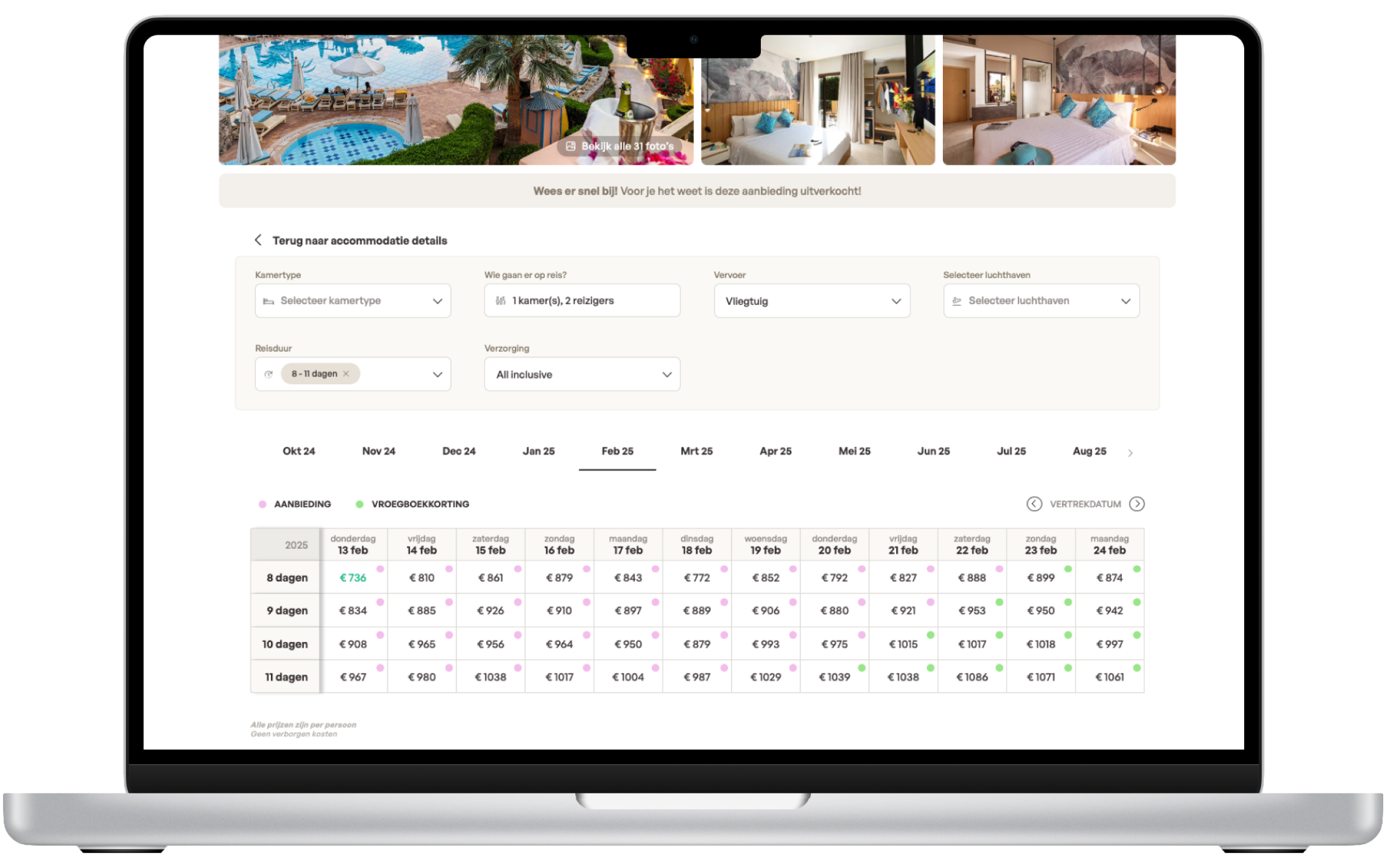
General view of the new price table based on departure dates and number of nights
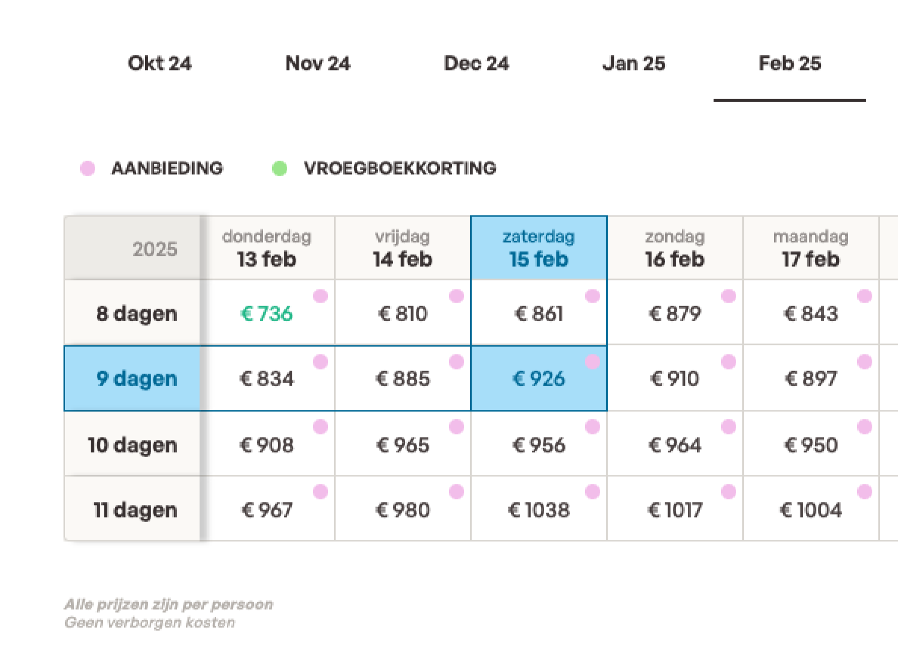
Detail of the new price table on a hover state
Added Functionality
Extra Features
The improvement of the price table was used as an opportunity to address and update outdated functionalities that needed to be rethought
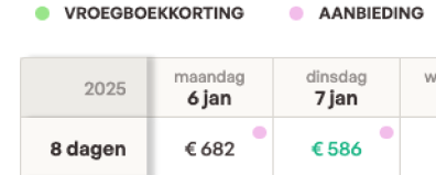
Promotion Indicators
Introduced small dots next to prices to highlight promotional rates while maintaining a clean design.
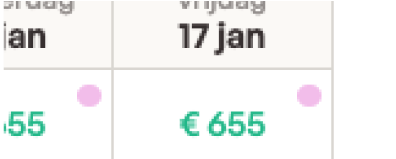
Highlighting the Lowest Price
The lowest available price was highlighted in green to facilitate quick comparisons.
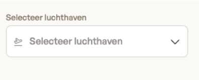
Redesigned Filters for the New Flow
Filters were updated to align with the new guided flow, further enhancing usability.
02.
The Room Selector
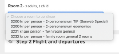
After the user selects a price from the price table, the next step is to choose the room type and allocate it based on the party composition. The previous room selector design, a simple dropdown, made it difficult for users to compare room options, prices, and occupancy details all in one place. This resulted in a tedious selection process, particularly given the complexity of Sunweb’s pre-packaged travel model, where comparing various combinations of room types and occupancies was essential. The challenge was to create a more user-friendly room selector that facilitated clear comparisons while adapting to the new streamlined price table.

Example of the old room selector using a dropdown for comparing all the options.
Core Issue
The Problem
Limited Comparison Ability
Users could not easily compare room details, prices, and occupancy options, as the dropdown format restricted content visibility.
Mismatch with the New Price Table
With the introduction of the improved price table, which allows users to compare prices based on departure date and duration, the old room selector no longer fit the new user flow, as it lacked a clear way to compare multiple room options.
Usability Issues
Design limitations, such as difficulty in displaying comprehensive information within the dropdown, resulted in a poor user experience.
Market Analysis
Competitors approach
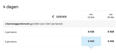
Few competitors offered travel packages in the same way as Sunweb, but one company with a similar approach was Corendon. In their process, the room selection was presented as a list of different room options for the preselected package. However, the key difference was that Corendon’s system already included the party composition, which simplified the selection process by reducing the need for users to manually configure room allocations.

Screenshot of the approach of the competitors for a similar product
Exploring the Initial Solution
Wireframe

The wireframe was tested with internal colleagues, and 100% of them successfully completed the tasks of selecting a room.
To begin designing a new solution for the room selector, a mockup was created with the following constraints:
- The room list was displayed once, regardless of the number of rooms needed or how the occupancy was configured.
- Users could view different prices based on the room allocation and the number of participants per room.
- All prices automatically updated if the number of participants changed.
- Rooms that did not match the selected allocation were hidden automatically.
- All data was preloaded to avoid any performance issues.
- Users could access the room descriptions at any time during the selection process.
- The room selection process guided users step by step.
- The overview of the selected rooms was presented in a clear and understandable way.
Early Designs
Medium Fidelity Prototype
After testing the wireframes with participants and confirming that they effectively addressed the identified problems while being easy to use, I proceeded to build a medium-fidelity prototype. This version was created using existing components from the design system, including elements such as prices, buttons, number steppers, labels, and collapsibles. The goal was to validate the solution with both stakeholders and users, ensuring consistency across the design system while streamlining the development process.
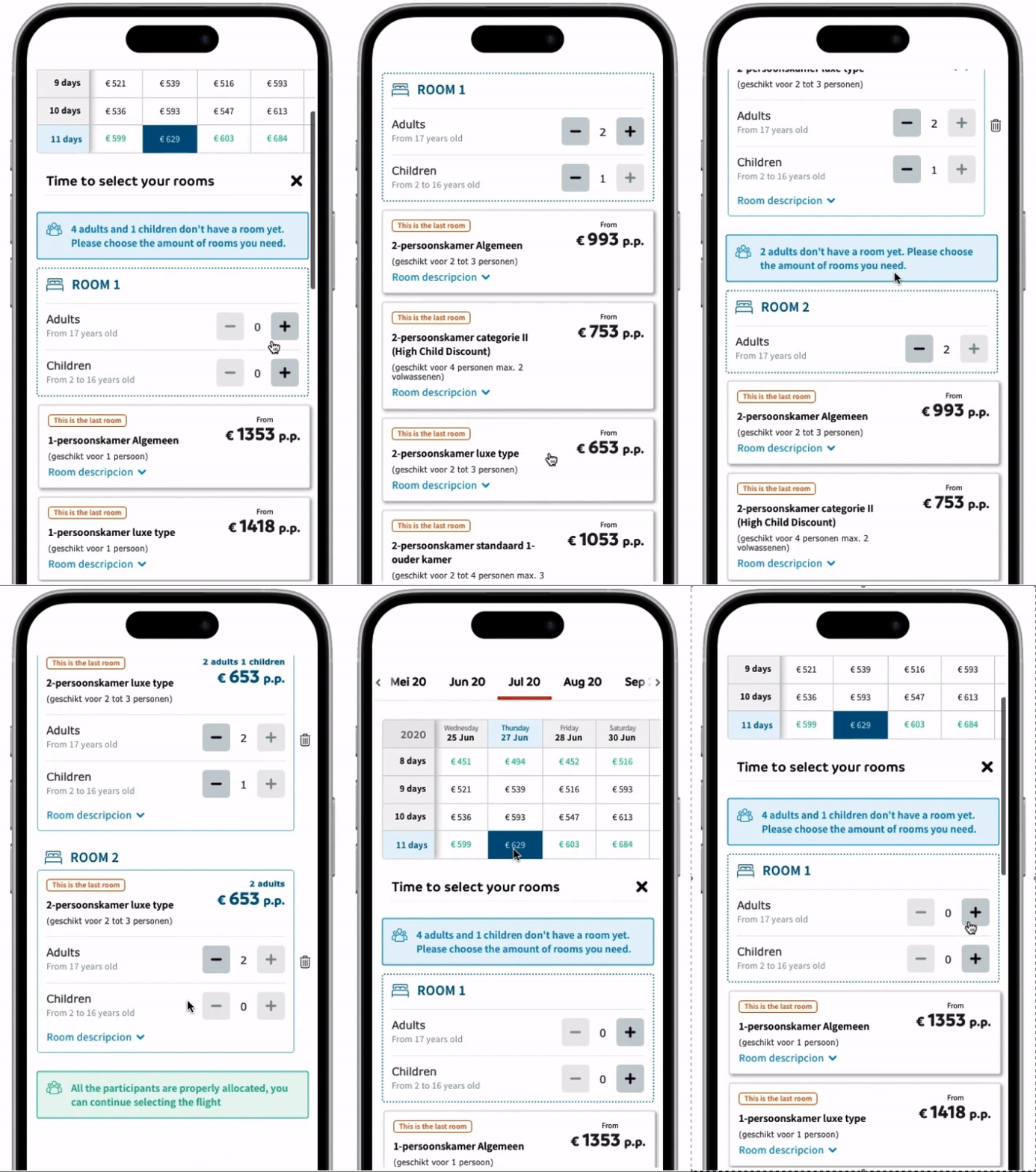
Working Example
Component in Action
Here are two examples of the price table matrix and room selector integrated into the design system. Although the room selector is currently live alongside the price table with room-based configurations, this example focuses on its functionality within the price table matrix.

Room selector example for Eliza on Design System

Room selector example for Sunweb Summer on Design System
Validating the Solution
AB Testing Results
We conducted an AB test with a small percentage of visitors to compare the new price table matrix and room selector against the previous version. The results showed a clear improvement in both conversion rate and total conversions. This positive outcome led us to proceed with implementing the new design for all users, optimizing the selection process and enhancing overall user experience.

Analytics from the AB testing showing the improved performance of the new price table matrix with room selector.
Project Retrospective
Project Goals and Outcome Evaluation
01
Streamlined Price Comparison Across Dates and Durations
Thanks to the guided filtering process, we solved the issue of overwhelming users with too many options at once. By implementing a step-by-step flow, we enabled travelers to easily compare prices across different departure dates and durations. Highlighting the lowest prices directly in the matrix further enhanced clarity and decision-making.
02
Enhanced Room Comparison for Different Party Compositions
The new room list interface addressed the limitations of the previous dropdown selector by presenting all room types in one view. This improvement allowed users to effortlessly compare room options and see updated prices based on occupancy changes. As a result, the selection process became more intuitive, and users could better understand their choices.
03
Smooth Digital Transition for the Package Selection Process
Leveraging the redesign to adapt the old catalog-based model into a modern digital experience, we created flexible components that worked across multiple brands. This approach allowed for a unified experience while accommodating various customer needs. Additionally, the redesign incorporated extra features like promotion indicators and redesigned filters, making the transition smoother and more aligned with user expectations.
© 2024 - marcgispert.com
Designed and developed with love 💛