Marc Gispert Saget
Digital Product Designer
Golf Service
Challenge: Help the user choosing the perfect golf service with the desired details in a more easy way.
On the primavera.nl site there are certain accommodations that allows the user to book golf as an additional service. This service can be booked, as the other services, on the booking steps page.
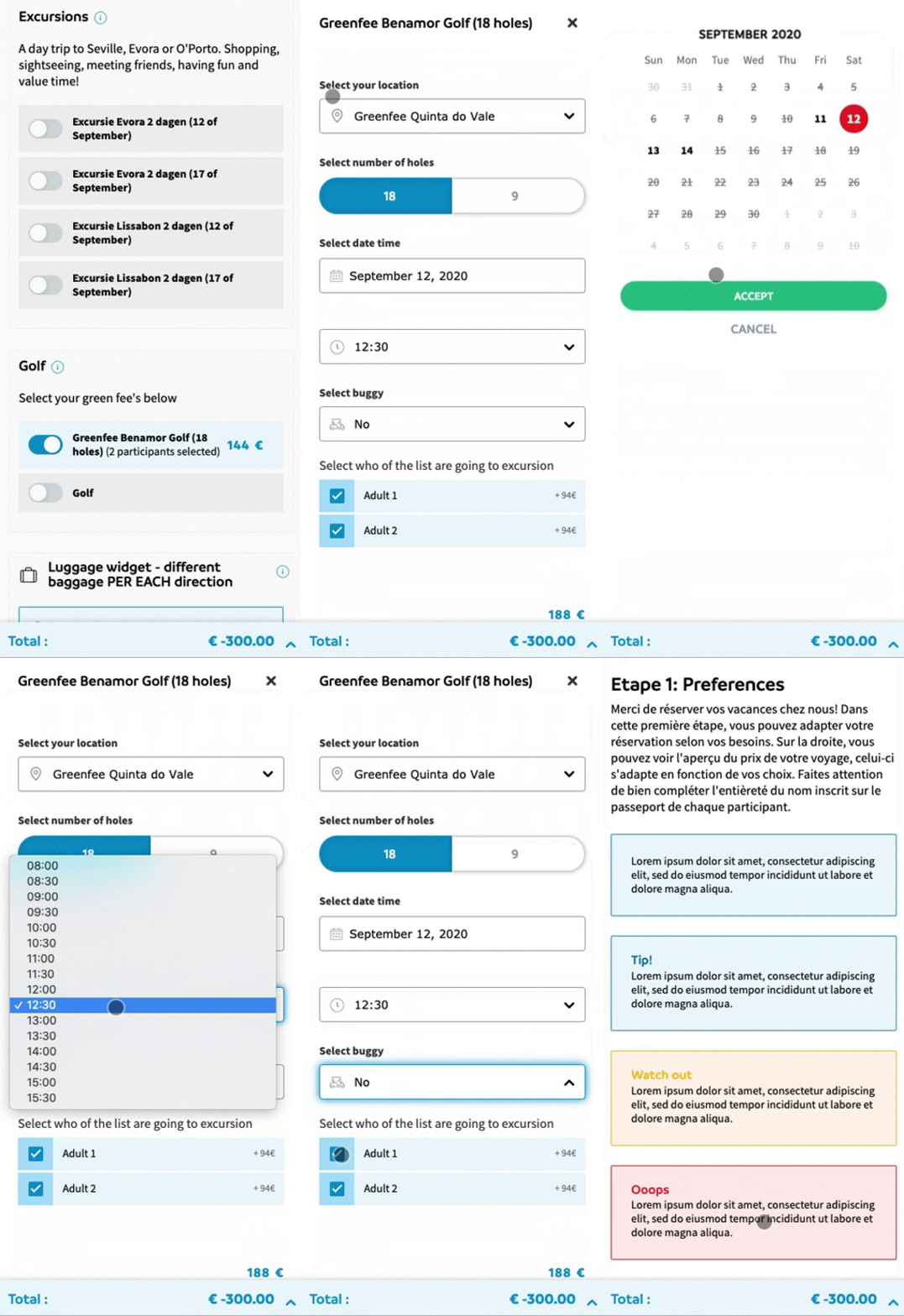
The component, that make the user able to book the appropiate golf service – choosing between place, number of holes, day, time, buggy rental and participants - was already running on the previous web version v4. But with several usability issues, and working in a different framework and style, than the Design System.

Brand
Primavera ReizenTimeline
2 sprints of 2 weeks (wireframing, prototype)Research
Based on ski ancillaries outcomesPrototyping
Wireframes and digital prototypesTesting
Usability tests (not final users)Strategy
UX strategyVisuals/UI
Existing elements from the design systemResult
Not tested yet with final usersURL
primaverareizen.nl
The main problem of the old behaviour
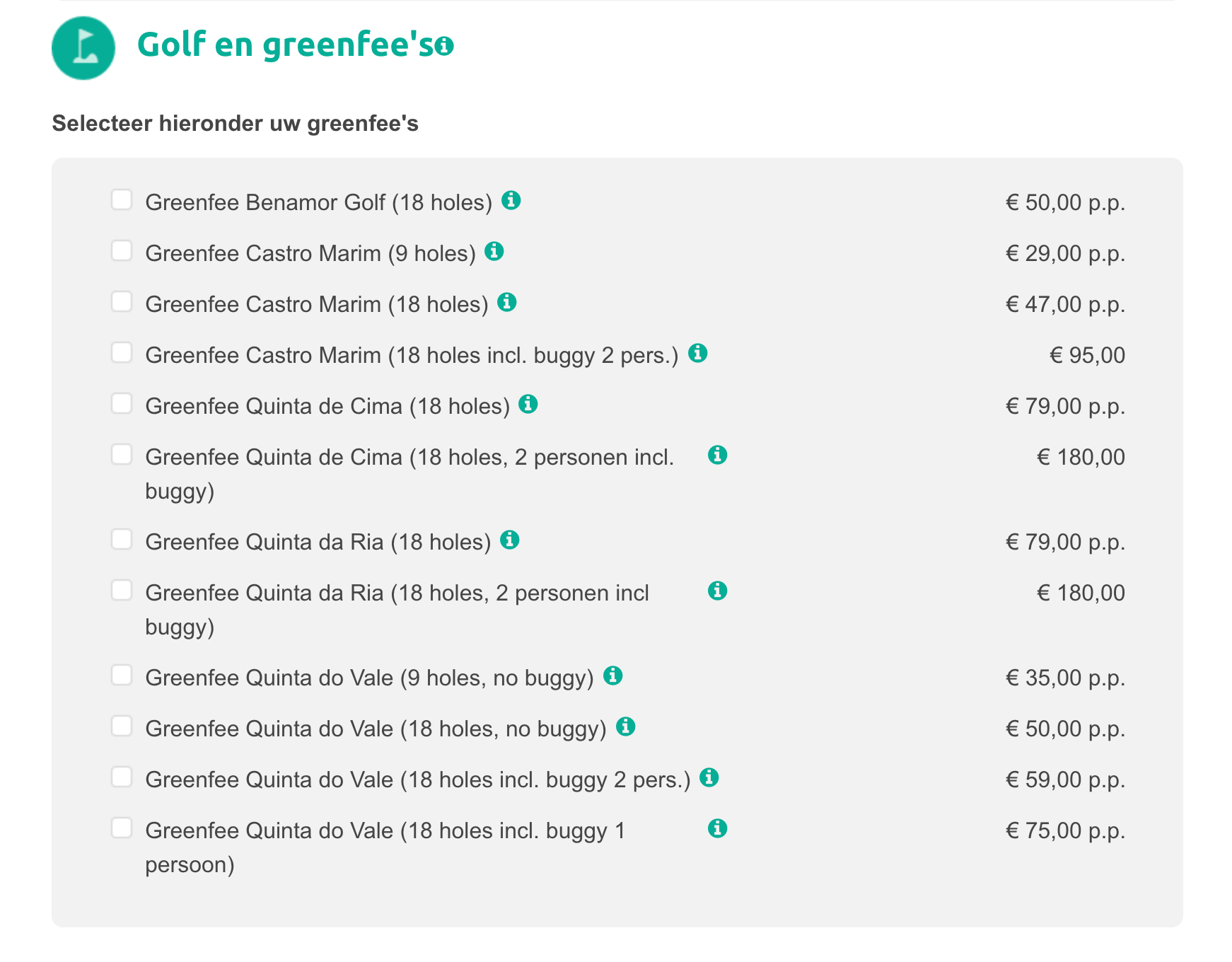
Before the upgrade the golf component was not only a enormous list of items made of big data strings with all the variables, but also an inefficient way of selecting dates and participants.

Old behaviour, where it can be seen a list with an item for every single combination, very difficult for the user to identify and choose the details.
Faced issues and actions taken
With the golf component – but also the dinner Boucher and the excursions component, the team had to take and process all the data coming from big strings of intertwined information. The sentences had to be broken and transformed into individual services - see the example below -.
Firstly, during the design process the information was split trying to create an interface where the user could easily identify the service they want to contract.
Secondly, during the code process it was reused the design system components.

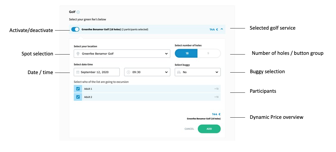
Detailed new approach of the golf item once it's open.