Marc Gispert Saget
Digital Product Designer
I’ve kept this case study in my portfolio to showcase, even with the limitations at the time, how I transformed a complex feature into an easy-to-use component.
Ski ancillaries
With this component my team and I had to take and process all the data coming from big strings of intertwined information. The sentences had to be breaked and transformed into individual services. During the design process I splited the information trying to create an interface where the user could easily identify the service they want to contract.
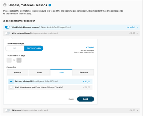
When I was doing the UI, I thought in components that can be reusable by all the teams through the sunweb design system. An example is the golf component my team did recently. The devs was able to sucessfuly print the golf information into the ski ancillaries skeleton.
Brand
SunwebTimeline
3 sprints of 3 weeks (spike, design, research)Research
Checking some other brands and the behaviour of the user on AnalyticsPrototyping
Wireframes and digital mockupsTesting
Individual interviews / site feedbackStrategy
UI/UX strategyVisuals/UI
Based on the defined design system elementsResult
Very positive feedback from the interviewed usersURL
www.sunweb.nl/wintersport
In the first implementation, before the design system, uysers gave us the feedback that the component was a big improvement in terms of usability and style
Which actions was taken in order to improve the widget usability?
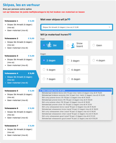
Before the upgrade the dropdowns contained all the information in a big strings of data with all the variables
old version
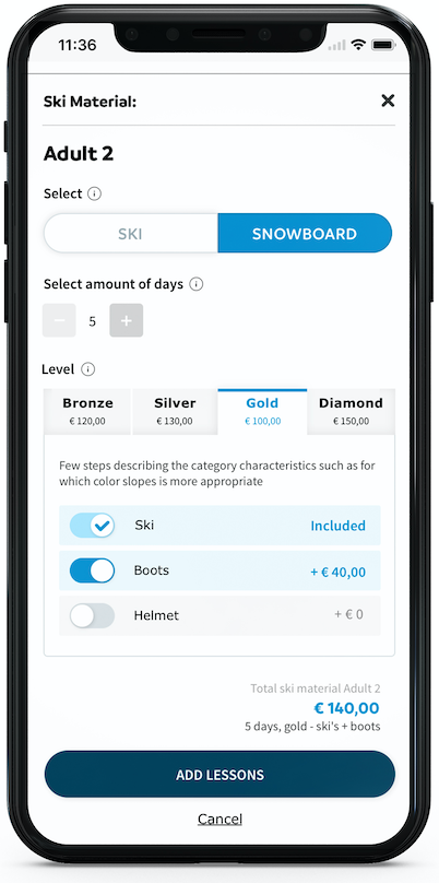
Compressing and giving the chance to activate/deactivate the full service
Adding a button-group for a few options
Reducing the space with a number stepper for the day selector
From a dropdown with all the options listed, to a tab system with all the information hierarchised and styled
new version
Usability testing
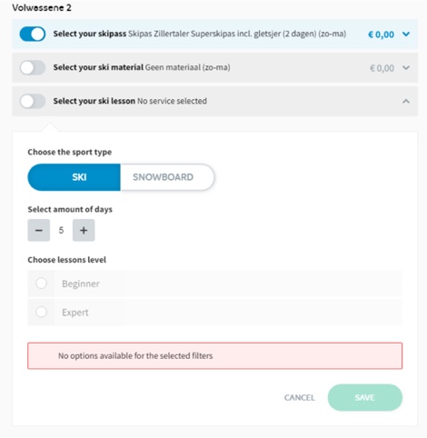
After the redesign of the ski ancillaries it was detected that in certain cases there is no option for specific days. For example (and the tested scenario), in an specific hotel there is no option to book lessons for 5 days but user can choose 4 or 6 days.
The team speculated that this lack of content for this specific selection can made the user feel not able to understand there are still options available after the specific number of days.
Test objectives
Be able to see if the user understands he can continue adding days through the number stepper in order to arrive to the selection he want.
Format and configuration
The test was made at the Girona’s office, with people from different teams, interviewed individually in person. It was considered that five participants could be enough for understand the behaviour.
It was moderated by a member of the team who was in charge to explain the scenario and the role of the tested user and answer the questions of the interviewed user when was needed.
Instructions given to the users for the test
You are go skiing with your friends 8 days, you want to book ski lessons 6 days, after the selection, you can continue with the booking.
Typology of participants
Because the team knew the other teams people’s personality, participants was chosen trying to find different attitudes.
Usability Test Outcome
Participant 1:Marc - optimistic and practical
User is not able to arrive to select 6 days. Because he was not able to find what he want, he decide to find a telephone number in order to call and ask for the specific selection.
Participant 2: Laura - optimistic and curious
She is not able to arrive to number 6, the user assume that because there is no content shown there is no option to continue. She decides to leave the site without any selection.
Participant 3: Dani - pragmatic
This user not only don’t understand that he can’t go further after the day 5 but also starts challenging different behaviours of the component. He decides to don’t rent the lessons on our site and do it when he arrives at the destination.
Participant 4: Robert - pessimistic and very critical
he was lost trying to understand every step, the team considered not relevant the outcome of this participant because he didn’t take the roll of a real user and he continuously wanted to share his hypothesis.
Participant 5: Lluis - apathetic
because he was not able to find the number of days for the category he want, he chose a different category (advanced instead of beginner) by error. So it was a different kind of fail.
Recommendations
Usability: With the tested design, users was not able to understand they can go further with the number stepper, when they are selecting amount of days and there is a disabled day.
Business: If people don’t have the specific selection they want, they just leave without any selection.
Marc Gispert Saget
Digital Product Designer
Web design and developement by: me :)
Email
Linkedin